Rosenstrasse is an original role-playing game that tells the true stories happened in WWII. The team leads by Professor Jessica Hammer in CMU and I'm the product/visual designer responsible for the art direction. I started with creating all the visuals for the game from the written storyline. I've also designed and developed a responsive web/mobile app to help to facilitate. This game was selected by Indecade 2017. It was also backed on Kickstarter by over 450 people.
Skills
Visual Design | Wireframing | Mock-ups | Web Design
Tools
Sketch | Photoshop | Illustrator | InDesign | Axure HTML5 | CSS | Javascript
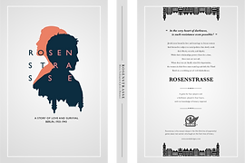
The Story of Love and Survival
It all started with reading the story of Rosenstrasse. Four couples lived in Germany experienced happiness, sadness, moral dilemma and desperation in a critical year in. We might have a history book to tell all the facts, but the lives of the people lived in that time and their struggles were not heard.
These were ordinary couples and now we were asking people to join us and relive they lived and remake the decision they made. This concept grew on me. After reading the touching story, it took a while for me to digest. I also watched the movie to understand more about that age. I created a mood board for the look and feel.
Tied all the Elements Together
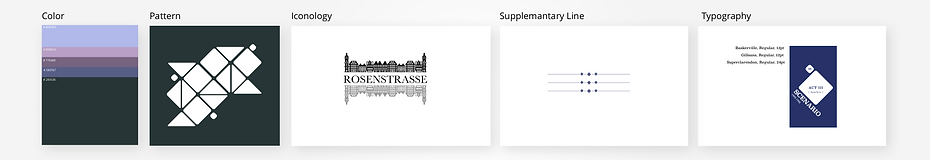
I used the mood board created earlier on to figure out the look and feel, color and tone for the overall experience. It was a content heavy game so I wanted the visual to be minimum complicity so that the story can stand out.
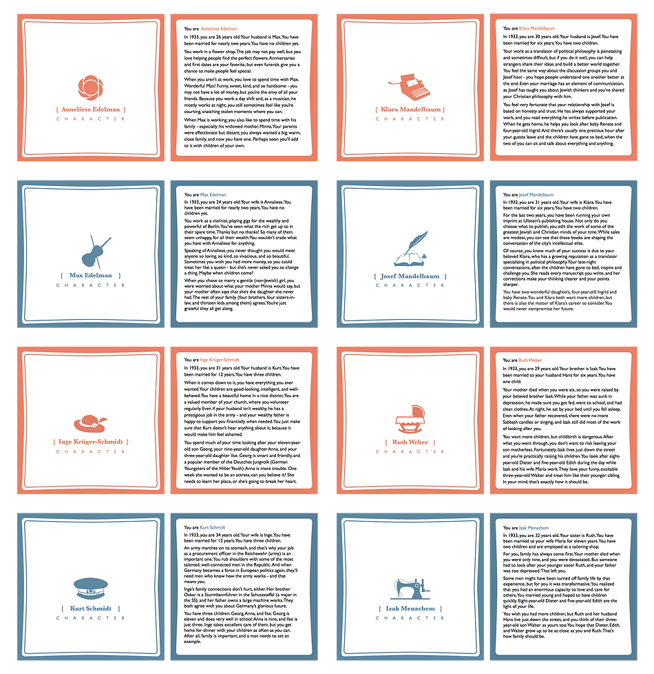
I created this diamond shape and applied it to all the cards. It provided a fun composition but not too much distraction. I laid out the information and composed them on the card cover. I then compared and picked color and shades that match the tone of the story. When the storyline got more complicated, the color became darker.
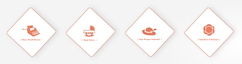
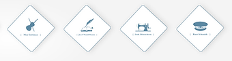
Let's Visualize the Characters
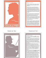
I tried to capture the essence of the story and I found the characters were the core of the stories. The players need to make connections with the role so that they can feel how they feel. I developed different concepts like silhouette and symbols. I reviewed with the team and we all liked the symbol very much since it was simple and direct, also represented the occupations and life focus for the character.
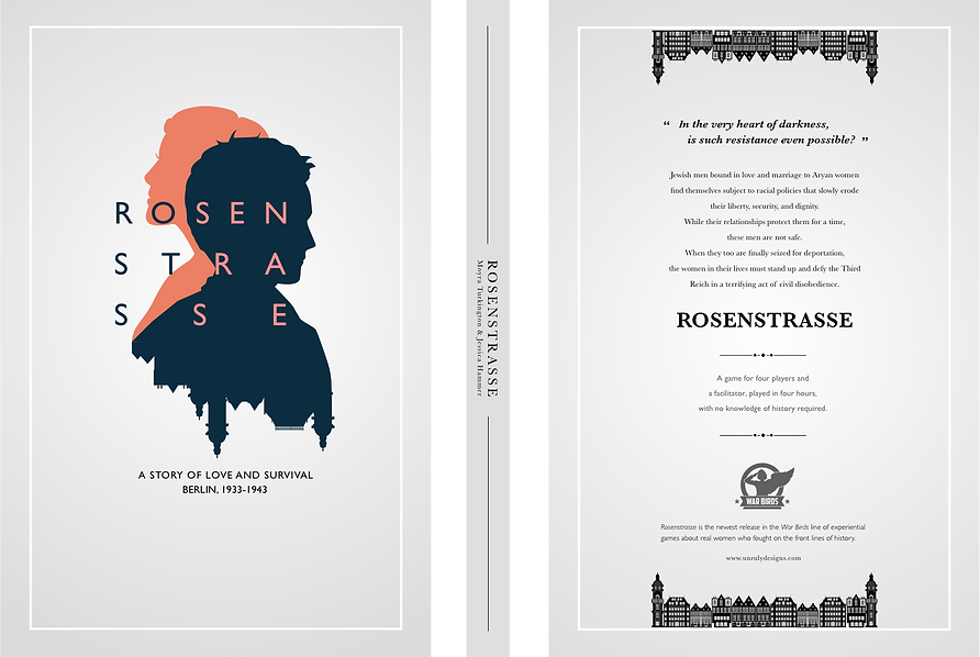
I later redesigned the silhouette for the cover, I used a contrast on both the characters and the text to make it interesting to the view. A skyline was also integrated subtly which reflected the logo design.
- early iterations -


- cover design -
- Icon design -
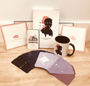
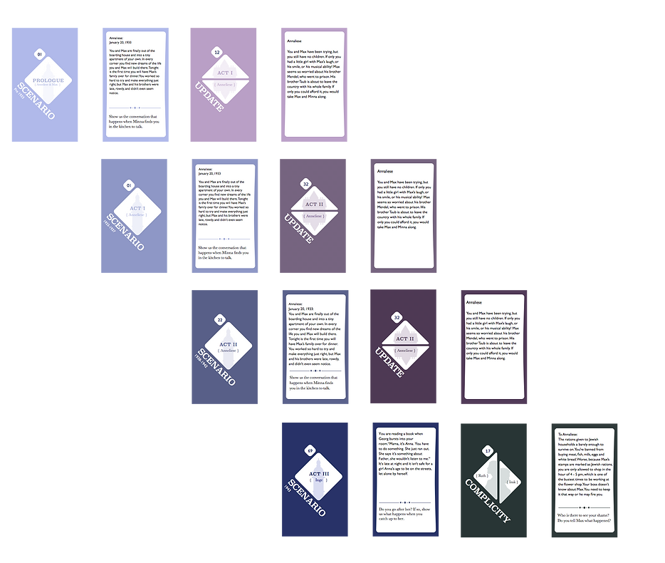
Final Print-Out
I've gone through with multiple rounds of visual iteration and with the help of the team. We laid out all the context on the cards and produced the final print-out of our book, the character cards as well as the scenario cards. The user will fully emerge in this four-hour long storytelling experiences.
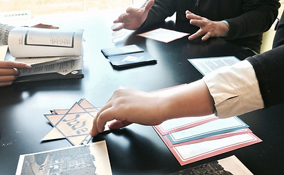
Noticed the User Pain-points
I've gone through with multiple rounds of visual iteration and with the help of the team. We laid out all the context on the cards and produced the final print-out of our book, the character cards as well as the scenario cards. The user will fully emerge in this four-hour long storytelling experiences.
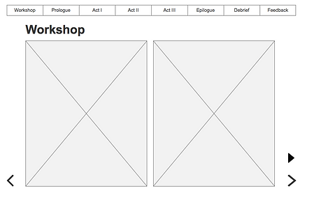
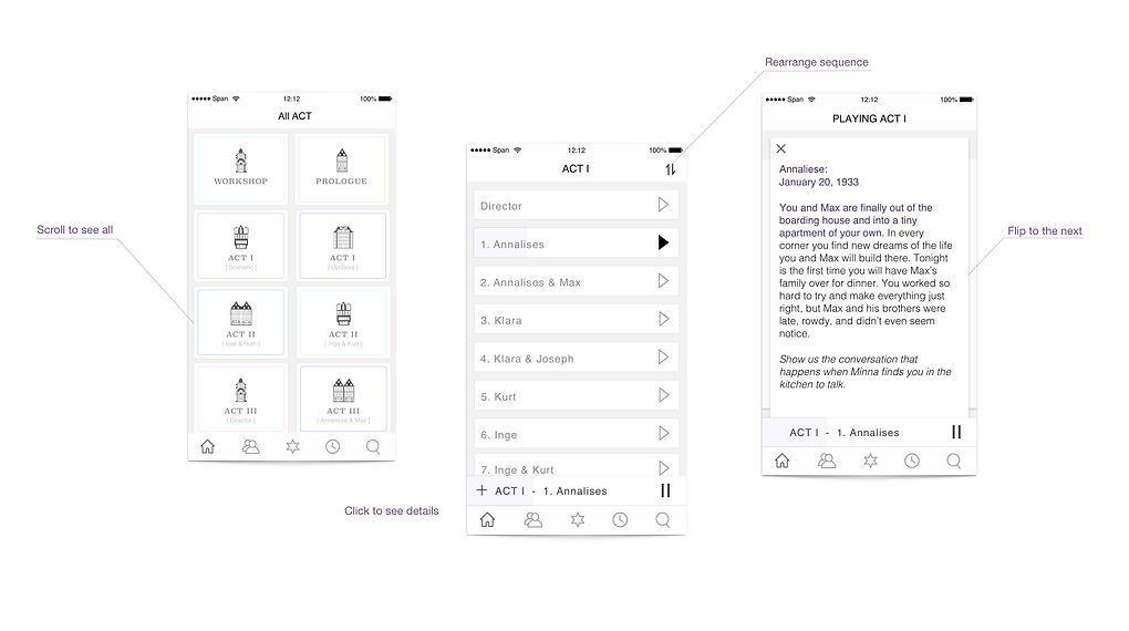
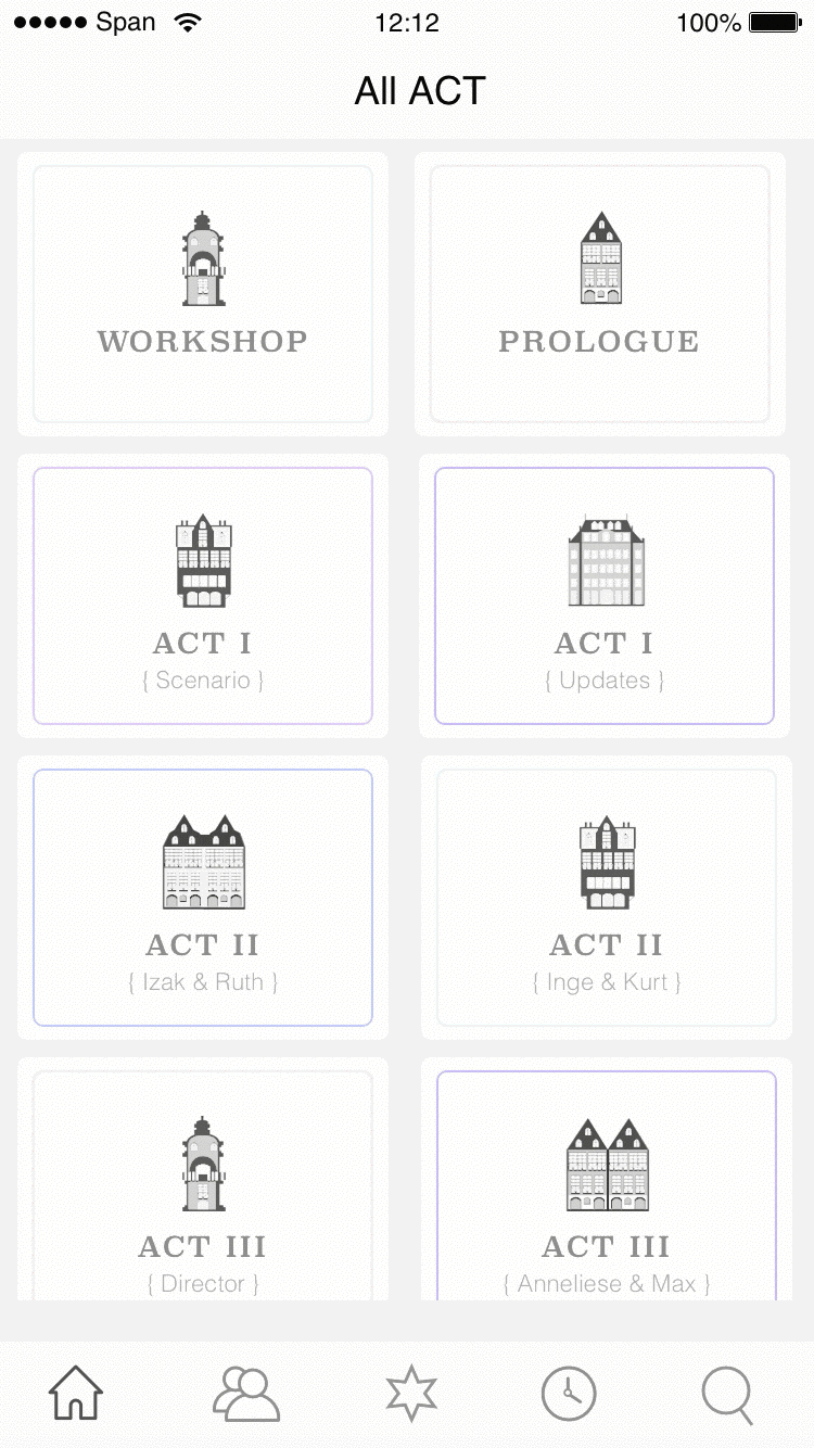
In the play-testing, we found it takes a lot of concentration for the facilitator to tell the story and find the cards. We wanted to provide a better experience. So I designed and developed a responsive web/mobile application to help facilitate.
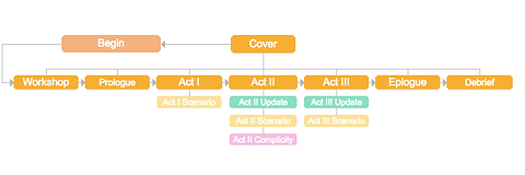
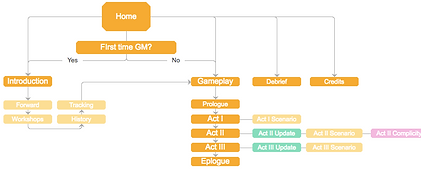
- Flow Structure -
Something Interactive, Something Immersive
We also have a strong sound designer in our team. He created theme melodies for each character. It also integrated sound effect along with the story. In this prototype, I was trying to demonstrate the possibility of having a music feature that integrates the story flow with the background music. So It can be used for facilitating as well as an audiobook for the player to read it.
In the play-testing, we found it takes a lot of concentration for the facilitator to tell the story and find the cards. We wanted to provide a better experience. So I designed and developed a responsive web/mobile application to help facilitate.
Narrative with Ambient Music
Thoughts & Learnings
This was a project that I thoroughly enjoy doing. We started with a team of four with writers, sound designer, and artist/UX. I enjoyed working in this team and I felt everyone bring out their best to make this meaningful narrative reach out to more people. I’m proud of the final outcome of the product.
My learnings for this is that:
- Make alignments. People might not understand what the visual system is, but they know if something is off. Always deliver a system instead of a visual piece. A system tells a story. A visual piece more like words that requires people themselves to make the connections.
- Experience is the core. It doesn’t really matter where’s the starting point of the project. There will always be some pinpoints in the user experience waiting for a designer to define and tackle.
- Be versatile. I learned to code a bit and I then understand more of how to integrate the design with the development. Sometimes it’s not one or another.
UP NEXT


