
Curer is an exploration project trying to use chatbot to connect patients with doctors. I've written a post of using the first principle to simplified current experience. In the process, I explored ways to utilize mobile platform and bring the healthcare resources closer to the target users.
Skills
Research | Structure design | UI Design | Conversational Design | Icon design
Tools
Sketch | Principle
What's the current problem?
All the interviewee mentioned the long wait and heavy bill of the current medical experiences. I've also found more in research that it's hard for those who live an unstable life to have a family doctor or having a long-term healthcare service with a specific facility. Thus they are unlikely to have a full health report when needed. They also tend to skip the follow-up to avoid the long wait.
On the other side, physicians would like to spend more time on each case and help the patient to monitor their symptoms and follow-up to avoid future problem. This is also more common for those patients who have chronicle diseases.
“I have to wait for weeks to get the appointment while the symptom already is gone.”
“I have no idea how much I will spend this time.”
- Patient, student
“I’m burning out by the non-patient work such as E/M coding, paperwork, etc”
“I want to help the patient prevent it instead of helping after it comes back again.”
“I’d like to know about the patient. It’s important for me to understand their mental activities over the last few weeks to figure out what cause the issues..”
- Physicians
Demographic
Base on the research from both side, I narrowed the target user first to that Low-mid income group. They don't have the family doctor, and some are new to the country. They are suffering from long-term chronicle disease, need regular health consultancy without lager time&money investment.


The Quest
I rethought the current healthcare experience. What’s the biggest problem and what's the ideal solutions? I came up a problem list and based on that I sketched out different ways to solve the current problem. I drew an ideal user journey map based on one of the solutions.
Problem:
-
profile inconsistency
-
hard to the schedule appointment
-
long waiting circle
-
unclear insurance coverage
-
time-consuming revisit
-
repetitive/unnecessary exams
-
hard to follow-up
Journey Map
Design Goal
In this map, I proposed the concept of a healthcare platform that the user first use chatbot to identify their basic symptom and connect them to reduce the communication cost. By Connecting the patient and doctor accurately by pre-diagnosis AI bot, create a sustainable healthcare circle with system profile, daily check-in, follow-ups, etc.
A traditional app vs a chatbot-based app?
We are getting used to those functional apps with various choices when we open it. We browser through different tabs and pages to find the information that they need.
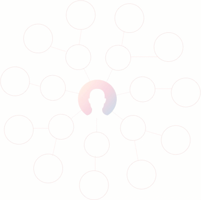
As a designer, we need to visualize the UI system and make it as intuitive as possible. However, in a medical experience, most of the time, the user enters the app without knowing what they should do. All they have is their own symptoms. in this chart, I used the circle to represent the function in an app. The chatbot can quickly help the users identify their starting points.
Interaction Structure

I developed three flows to integrate different features into the conversation. However, based on the choices is given out to the user, each of them could have advantage and disadvantage in a different context. The best way to utilize them is to base on the choices itself to switch from one to another.
I also realized that the chatbot by natural simplified the information for the user-end to digest, it also creates problems when the user makes mistakes, try to go back to a certain point and then go back. The conversational tree can have so many branches and the design purpose for VUI is to narrow it down and lead the user.
User flow
I've tried to demonstrate one user flow based on the integrated methods. On the left, I created a scenario where the user feeling uncomfortable the first time, so he opens the app and talk to the chatbot, while they are talking, he can see where he's at in the whole process on the bottom. The chatbot will go through the procedure with him and note down the symptom. The user can also click on the list to quickly access to a certain step. In this case, he can skip the describe other syptom and go ahead to schedule clinic visit.


Interface Design
User Case: Health Report
Another insight coming from the user research was that the user wanted to understand their current health status. While they might have several exams report, notes, or health report, it didn't explain well with all kinds of medical terms. A digital dashboard will give them a clearer view of the medical history, health status, and also future trend.
At left is one of the sample tables for measuring obesity, with only data, terms, and norms. It is not user-friendly to the patient without too much medical knowledge. So I started to design an interface for the user to quickly digest the information. And using the chatbot, they can get more feedback on certain test results.

I've designed three ways to interpret the report. They each have different approaches for the user to navigate through.
1
The left sidebar shows the different categories. The center part contains the medical history and overall trend for that specific categories. On the right, there are more detailed reports for the user to click through. Using the magnify tool at the right bottom, the user can ask the chatbot questions.
2
This is a more visualized approach. Using a 3D humanoid model in the center stage, the user can click through and see the detailed report for each part. They can also start a chat based on a certain report.


3
Top bar lists all the reports the user have. The main part shows the overall view of the reports. On the bottom, the user sees the overall trend. The chatbot will provide the detailed stats when user click on the main part. The user can also drag them to the chat window for more explanations.

Mock-up & Usablity-test
The tests was based on two things: first was to find different types of report data and test it to see if it can adapt to the interface. Second was to ask the user to navigate through them and find the problem while using it. In the process, I found that while getting a general idea of ones' completed report is ideal, it was hard for our target user to do a full body scan, their symptoms may mainly within one category. Also, utilized the chatbot can help explain more of the detail information in the reports, which can help achieve our design goal. Overall, the third one seems the most promising. I later iterated on it and made an visualized prototype.
Dashboard Design
In the design process, I did some iterations for each part of the design, for example, the tab of the file. I also found the information can be too crowded in one center chart when the report itself is complicated. A swap function was added later on to make it more easy to navigate.
I also moved the "drag to ask" bar on the top right to make the message part more easy to navigate.

What's more
- Customization: Although it'd be ideal to have a digital record for the user, considering the demographics, having a record that customized by them would be more useful to them.
- Openness: I only designed a very small part of this platform, but I'd imagine it to be an open platform that makes the healthcare resources opens to all.
- Trustworthy: Trust is a big issue for patients. How to build trust with an AI bot is largely dependent on the character design. Also, an interfering system will intervene system will allow the patient to ask for emergency help. Privacy is also a big issue especially for the patient with certain diseases.
UP NEXT


